
Tableau Charts and Graphs
Tableau Charts & Graphs
In this tutorial, ‘Sample-Superstore.csv’ is used for the demonstration. You can connect to the data source and follow the steps given in the tutorial.
Measure names and Measure values- Generated Fields
- Understand how and when to build different types of Visuals
- Pareto Chart
- Bullet Chart
- Bar Chart
- Line chart
- Text Tables
- Heat Map
- Waterfall Chart
- Gantt chart
- Pie Chart
- Scatter Plot
- Area Chart
- Dual Axis Chart
- Bubble Chart
- Histogram
Measure names and Measure values:
Measure names and Measure values are the two fields created in Tableau by default. These fields are created when a data set is imported into Tableau. You can go to a Data pane of the worksheet and view the fields as shown in the figure.

Measure Names:
A measure name consists of all the names of the measure present in a data set. It always presents at the end of dimension list. It consists of discrete values of all measure names.
Measure Values:
All the measure values present in a data set are kept together in the field called measure values. It always presents at the end of measures list. It consists of continuous values of all measures.
Use cases of Measure Names and Measure Values:
Case 1:
Measure names and Measure values can be used to see the aggregation of all measure present in a data set. These fields can be shown as different types of visualization in Tableau.
Steps:
- Drag ‘Measure Names’ into Columns.
- Drag ‘Measure Values’ into Rows.
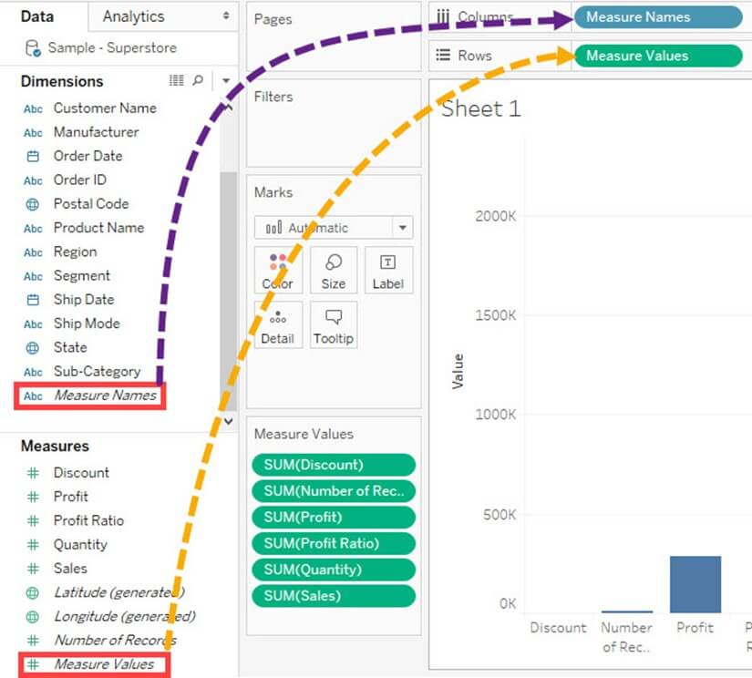
It creates a visual for all measures present in the data set. By default, Tableau creates a bar chart showing all the measure names and their values.

Case 2:
Any measures can be removed from the visual by removing the measure from mark card. It can be removed by
- Right-click on a measure name.
- Click on ‘Remove’ option.
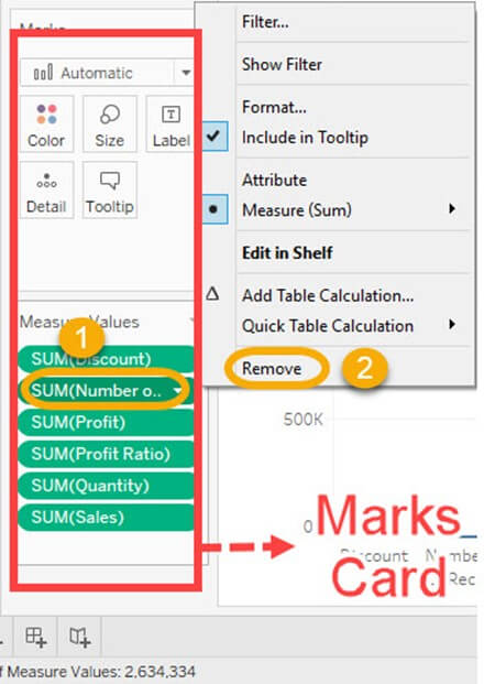
It removes the measure from the visualization.

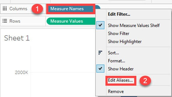
Case 3:
Alias name can be created for measure names. It can be shown in the visualization for better identification.
Step 1) Use the same steps given in case 2 and follow the below steps.
- Right click on measure name present in Columns.
- Select the ‘Edit Alias’ option in the list.
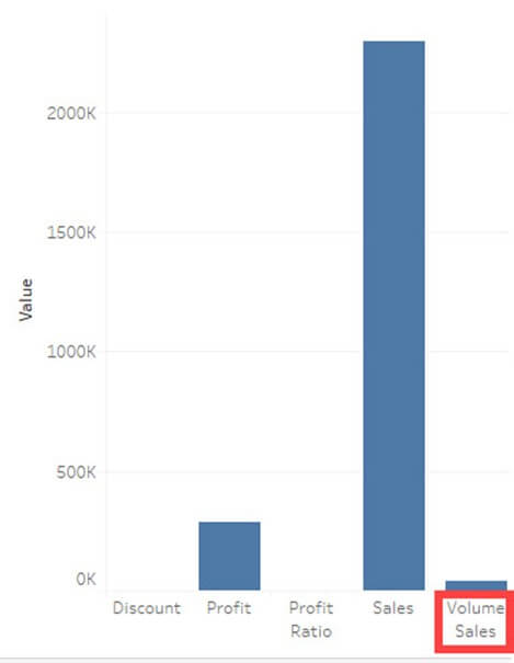
Step 2) It opens ‘Edit Aliases’ Window.
- Edit the alias name for the member. In this example, ‘Volume Sales’ is given as alias name for ‘Quantity’.
- Click on OK.

You can see the name change in Visualization.
Case 4:
If you want to analyze multiple measures in a single visual, it can be done by using measure names and measure values.
In this example, we will see the trend of measures namely sales, profit and quantity over the years.
Step 1)
- Drag measure values into the filter box.
- It opens a filter window.
- Check out all the measures except Profit, Quantity, and Sales.
- Click on OK button.
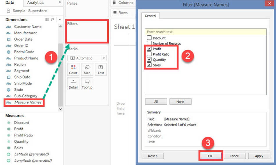
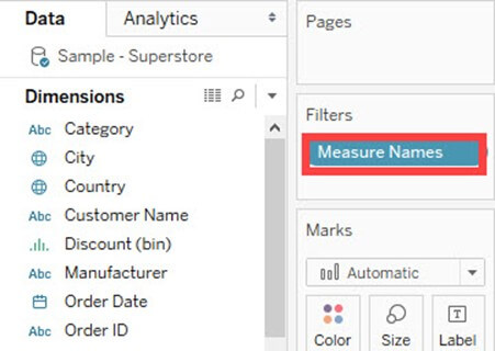
It adds the measure name filter in the filter box.
For example The above filter condition shows the visual as follows:

It creates a filter on selected measures in the worksheet.
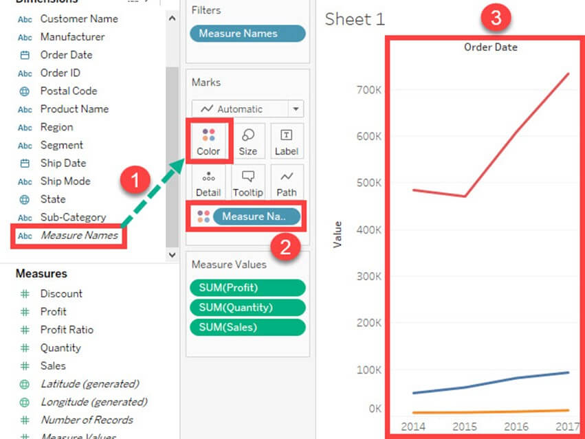
Step 2)
- Drag ‘Order Date’ into Columns.
- Drag ‘Measure Values’ into Rows.

Step 3)
- Drag Measure Names into ‘Color’ option present in the marks card.
- It creates color of the visual based on the measure name. It also specifies different color to different measure names present in the visual.
- A line chart is generated for multiple measures over years as shown in the figure.
Generated Fields:
Tableau generates some fields which can be visible in the data pane. These fields are generated in addition to the fields present in the data set. The generated fields are given as follows.
- Measure Names
- Measure Values
- Number of Records
- Longitude
- Latitude
Measure Names and Measure Values are already explained in the article.
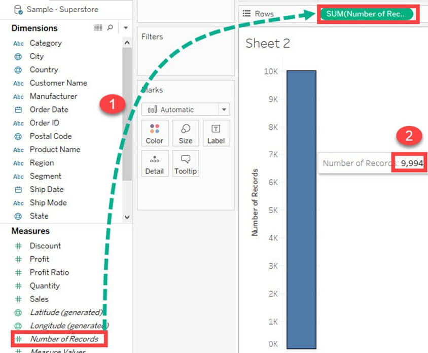
Number of Records:
Number of records shows the count of records present in the data set. It is an auto-generated field in Tableau which assigns a value ‘1’ for each record present in the data set. It can be used to verify the count of records when joining multiple tables. The procedure to check the number of records present in a dataset is given as follows.
Step 1) Go to a Worksheet
- Drag ‘Number of Records’ present in measure pane into Rows.
- It creates a bar chart by default. Hover over the bar to see the number of records present in the data set.
Longitude and Latitude:
Longitude and Latitude (generated) fields are associated with the geographical detail present in the data. Dataset should consist of geographical details like City, Country or State. The longitude and latitude values are auto-generated in Tableau. These fields can be used to build maps in Tableau. You can create geographical maps using Longitude and Latitude is given as follows.
Step 1) Drag Longitude (generated) into columns and Latitude (generated) into Rows.
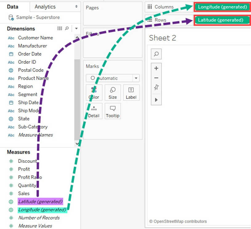
Step 2) Drag ‘State’ from Dimension list into ‘Detail’ present in Marks Card.
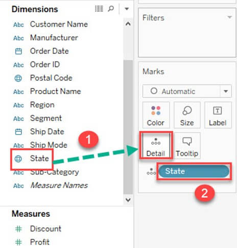
This creates a geo-mapping visual as shown below.

Understand how and when to build different types of Visuals:
Tableau can create interactive visuals for easy data interpretation. You can create various types of graphs in Tableau based on the purpose. The different charts that can be created using Tableau and their purpose are given as follows.
How to create Pareto Chart
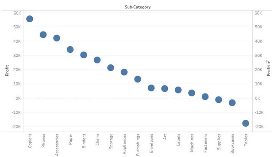
A Pareto chart consists of both bar and line graph. The same measure is used to create the graphs but the measure values are manipulated differently. The purpose of using Pareto Chart in Tableau is to identify the contribution of members present in a field. For example, Profit contributed by different subcategory of products in a retail store can be analyzed using Pareto Chart. It can show the top members and their contribution. The procedure to create a Pareto Chart is given as follows.
Step 1) Go to a new Worksheet.
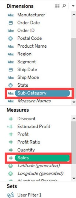
- Drag ‘Sub-Category’ into Columns.
- Drag ‘Profit’ into Rows.

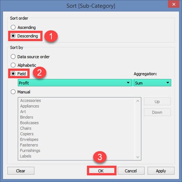
Step 2) Right click on ‘Sub-Category’.
- Select ‘Sort’ option from the list.

Step 3) It opens a Sort Window.
- Click on ‘Descending’ in Sort order.
- Select ‘Field’ in ‘Sort by” section. Select the field as Profit and choose ‘Sum’ as aggregation.
- Click on OK.
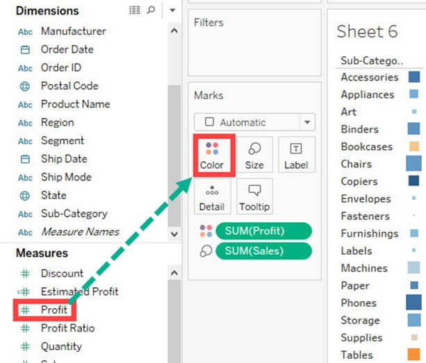
Step 4) Drag ‘Profit’ again into Rows.
- Right-click on the newly added ‘Profit’ and Select ‘Dual axis’ option.
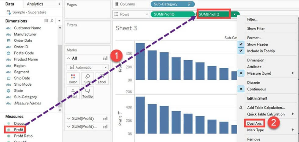
It merges the x-axis of both measures and converts the visualization as given below.
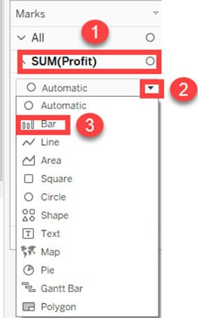
Step 5) Go to Marks Card.
- Select ‘SUM(Profit)’ for the marks card list.
- Click on the drop-down button as shown in the image.
- Select ‘Bar’ as chart type.
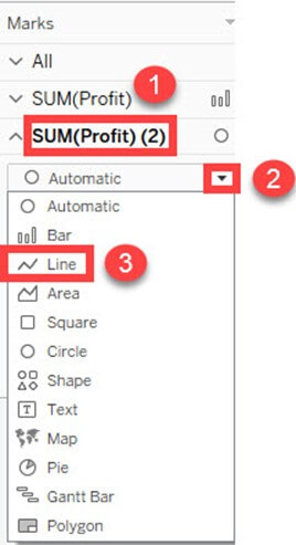
Step 6) Select ‘SUM(Profit)(2)’ from the marks card list.
- Select the drop-down button as given in the image.
- Click on ‘Line’ from the list.
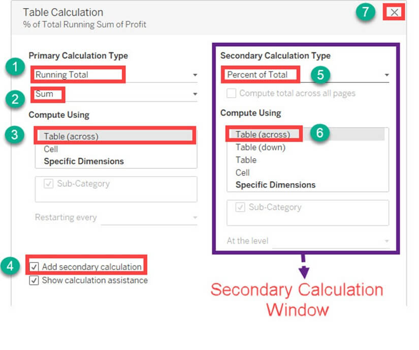
Step 7) Select ‘SUM(Profit)’ on the right side of rows as shown in the image.
- Right click on it and select ‘Add Table Calculation’ from the list.

Step 8) It opens the Primary Calculation Type window.
- Select ‘Running Total’ from the drop-down.
- Select ‘Sum’ as aggregation from the drop-down.
- Click on Compute Using ‘Table (across)’.
- Check in the ‘Add Secondary Calculation’ box.
- It expands the window for ‘Secondary Calculation Type’. Select ‘Percent of Total’ from the dropdown list.
- Select on Compute Using ‘Table (across)’
- Now close the Window by clicking on close icon as shown in the image.
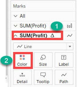
Step 9) Go to the last marks card namely ‘SUM (Profit)’.
- Click on color icon present in the marks card.
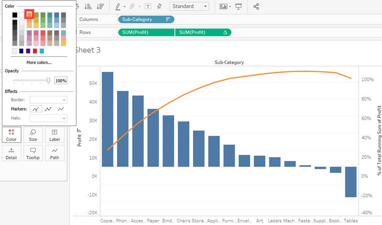
Step 10) Select any color of your choice.
This changes the color of line present in the graph.
This is the procedure to create Pareto Chart in Tableau.
Bullet Chart:
A bullet chart can be used as a gauge or indicator to show the performance of measures. Two measures can be compared to each other using the bullet graph. For example, if we are having estimated profit and actual profit we can compare both of them using bullet chart. The procedure to create bullet chart is given as follows.
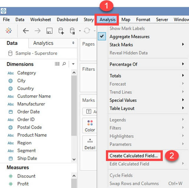
Step 1) Go to a new Worksheet.
- Click on ‘Analysis’ present in the Menu bar.
- Select ‘Create Calculated Field’ from the list.
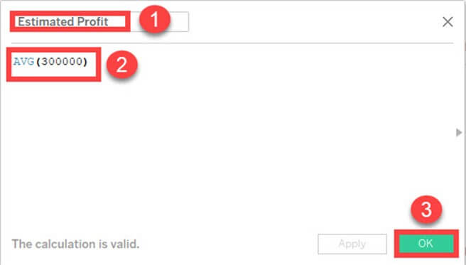
Step 2) It opens Calculated Field Window.
- Enter a name for the calculated field. In this example, it is named as ‘Estimated Profit’.
- Type the estimated value of the measure. In this example, Profit is taken as the measure. So the calculated field is created for estimated profit.
- Click on OK.
Step 3) Go to measures in Data pane. Hold the control key on keyboard and select ‘Estimated Profit’ and ‘Profit’.
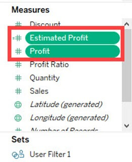
Step 4)
- Click on ‘Show me’ button present in the top right corner of the worksheet.
- Select bullet graph icon as shown in the image.
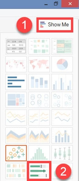
It creates a bullet graph as shown below.

Bar Chart:
A bar chart can compare the data across different categories. The height of the bars represents the measured value of each category. It can be represented as vertical and horizontal type bar charts. The procedure to create bar chart is given as follows.
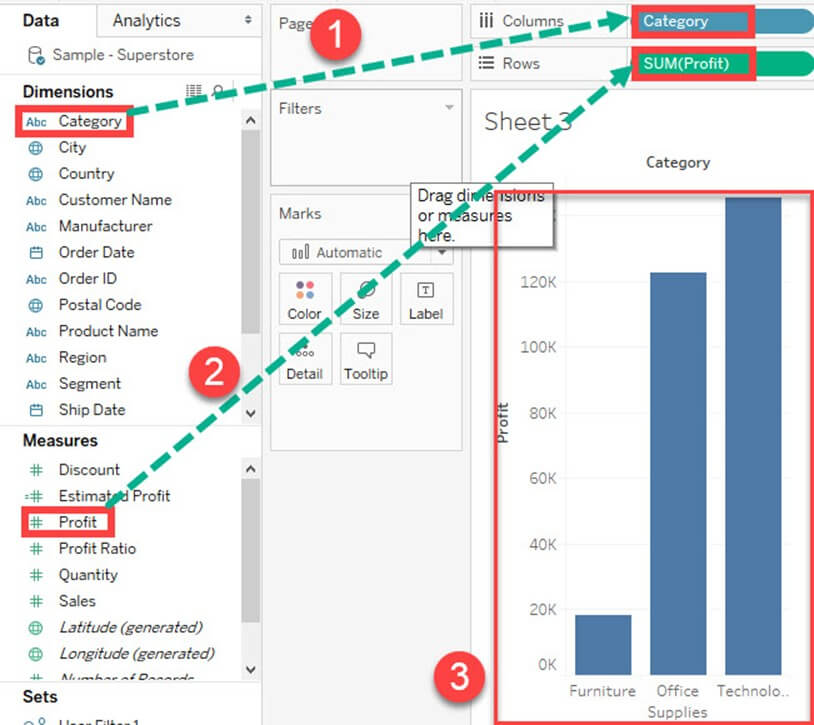
Step) Go to a new worksheet.
- Drag ‘Category’ into Column.
- Drag ‘Profit’ into Rows.
- It creates a bar chart by default.
Line chart:
A Line Chart should be used to compare the data over the different periods. A line chart is created by the series of dots. These dots represent the measured value in each period. The procedure to create line graph is shown below.
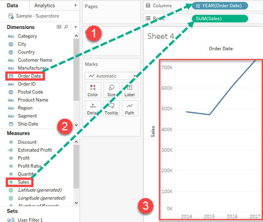
Step) Go to a new Worksheet.
- Drag ‘Order Date’ into Columns.
- Drag ‘Sales’ into Rows.
- It creates a line chart by default.
Text Tables:
Text tables are used to show the exact value of measures across the different dimension. A text table is also called as a Pivot Table. It groups the dimensions and measures by default. The procedure to design a text table is given as follows.
Step) Go to a new Worksheet.
- Drag ‘Sub-Category’ into Rows.
- Drag ‘Profit’ into text box present in the marks card.
- It creates a text table by default.

Heat Map:
A heat map can visualize the data in the form of size as well as color on different measures. Two different measures can be visualized simultaneously using heat map. One measure can be assigned to size whereas another measure can be assigned to the color of the heat map. The procedure to create heat map is given as follows:
Step 1) Go to a new Worksheet.
- Hold the control key on keyboard and select ‘Sub-Category’ and ‘Sales’ from the data pane.
Step 2)
- Click on the ‘Show me’ button present in the top right corner of the worksheet.
- Select the ‘Heat Map’ icon as shown in the image.

Step 3) Drag ‘Profit’ into the Color box.
Step 4)
- Drag ‘Region’ into Columns.
- This will create a Heat map. It can be used to visualize Sales and Profit across different dimension.

Waterfall Chart:
Waterfall Chart can visualize the cumulative effect of a measure over dimension. It can show the contribution of growth or decline by each member in a dimension. For example, you can see the contribution of profit by each sub-category using a waterfall chart. The waterfall chart can be designed in Tableau by following the given procedures.
Step 1) Go to a new Worksheet.
- Drag Sub-Category into Columns
- Drag Profit into Rows.

Step 2)
- Right click on ‘Profit’ present in Measures Pane.
- Choose ‘Create’ from the list.
- Select the ‘Calculated Field’ Option.

Step 3) It opens ‘Calculated Field’ Window.
- Enter the name of the Calculated field as ‘-Profit.’
- Write the formula as shown in the image.
- Click on OK.

Step 4) Drag the newly created calculated field ‘-Profit’ into size option present in the marks card.

Step 5)
- Right, Click on ‘SUM (Profit)’ present in the Rows.
- Select ‘Quick Table Calculation’ from the list.
- Click on ‘Running Total’ option.

Step 6)
- Click on the drop-down option present on the marks card.
- Select ‘Gantt Chart’ from the list.

This creates a waterfall chart as shown below.

Gantt chart:
A Gantt chart can show the comparison of data between categories. It can be used to identify the time taken for each process. In the below example, time taken for shipment by each type of ship mode is given. The procedure to create Gantt chart is given as follows.
Step 1) Go to a new Worksheet.
- Click on the drop down button in Marks Card.
- Select ‘Gantt Bar’ from the list.

Step 2)
- Drag ‘Order Date’ into Columns.
- Right Click on the Order date and select the ‘Day’ as shown in the image.

Step 3)
- Click on ‘Analysis’ Present in Menu bar.
- Select ‘Create Calculated Field’ present in the list.

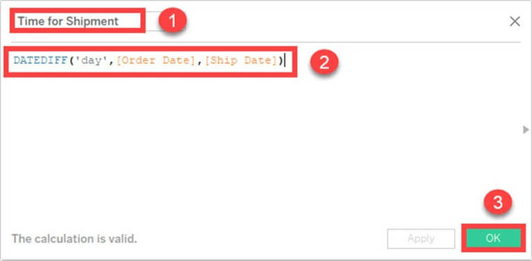
Step 4)
- Enter the name of calculated field as ‘Time for Shipment’
- Type the formula as shown in the image to create difference between order date and ship date.
- Click on OK.
Step 5)
- Drag ‘Ship Mode’ into Rows.
- Drag ‘Time for Shipment’ into size icon present in the marks card.

Step 6) This creates a Gantt chart. It shows the time taken for each shipment across different ship mode.

Pie Chart:
A pie chart can show the segment-wise data. It can show the contribution of measure over different members in a dimension. The angle of pie determines the measured value. Different colors can be assigned to pie to represent the members in a dimension.
Step 1) Go to a new Worksheet
- Select Segment and Sales from data pane.

Step 2)
- Click on ‘Show Me’ button present in the top right corner of the worksheet.
- Select ‘Pie Chart’ from the list.

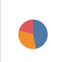
It creates a Pie Chart as shown below.
Scatter Plot:
The relationship between two measures can be visualized using scatter plot. A scatter plot is designed by adding measures in both x and y-axis. This can show the trend or relationship between the measures selected. A scatter plot can be designed by following the below procedure.
Step 1) Go to a new Worksheet.
- Drag ‘Discount’ into Columns.
- Drag ‘Sales’ into Rows.

This creates a scatter plot by default.
Step 2)
- Drag ‘Sub-Category’ into Color icon present in the Marks card.
- It creates a scatter plot showing the relationship between discount and sales for each sub-category.

Area Chart:
Area chart can represent any quantitative (measure) data over different period of time. It is basically a line graph where the area between line and axis is generally filled with color. The procedure to create area chart is given below.
Step 1) Go to a new Worksheet.
- Hold the control key on keyboard and select ‘Order Date’ and ‘Quantity’.
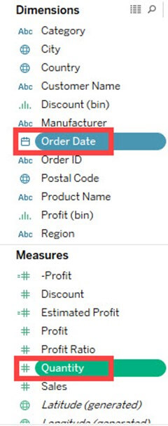
Step 2)
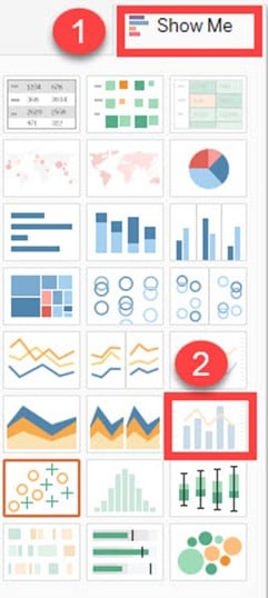
- Click on ‘Show Me’ option present at the top right corner of the worksheet.
- Select the Area chart icon as shown in the figure.

Step 3)
- Drag ‘Region’ from dimension pane and add it in color icon of Marks card.
- This creates an area chart as shown in the image.

Dual Axis Chart:
Dual axis chart can be used to visualize two different measures in two different chart types. A date column and two measures are necessary to build a dual axis chart. The different scales used in the graph helps the user to understand both measures. The procedure to create dual axis chart is shown below.
Step 1) Go to a new Worksheet.
- Hold the control key and select ‘Order Date’, ‘Sales’ and ‘Quantity’.

Step 2)
- Click on ‘Show Me’ option present in the top right corner of Worksheet.
- Select ‘dual combination’ icon as shown in the image.
It creates a dual axis chart as shown in the figure.

Bubble Chart:
A bubble chart visualizes the measures and dimensions in the form of bubbles. The sizes of the bubbles determine the size of measure value for effective visualization. The color of bubbles can be set to differentiate the members present in a dimension. The procedure to create bubble chart is given below.
Step 1) Go to a new Worksheet.
- Hold on the Control key in the keyboard.
- Click on ‘Sub-Category’ and ‘Sales’.
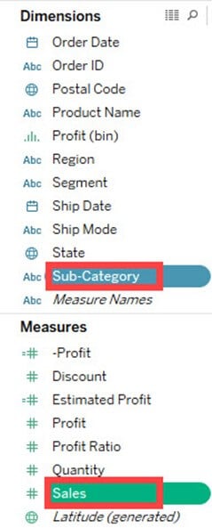
Step 2)
- Click on the ‘Show Me’ option present in the top right corner of the worksheet.
- Select the ‘Packed bubbles’ icon as shown in the image.

It creates a bubble chart as shown below

Histogram:
A histogram can show the values present in a measure and its frequency. It shows the distribution of numerical data. As it shows both frequency and measure value by default, it can be useful in many cases. For example, if you want to analyze the discount given by a retail shop, you can visualize the amount of discount and its frequency using histogram. The procedure to create histogram is shown below.
Step 1) Go to a new Worksheet.
- Select ‘Discount’ from the measures.

Step 2)
- Click on ‘Show Me’ button present in the top right corner of the worksheet.
- Select the ‘Histogram’ icon as shown in the image.

It creates a histogram chart in Tableau.


Comments
Post a Comment