
Create Line Chart in Tableau
What are Line Charts?
A line chart is used to represent multiple data points connected together with a single line. These data points on a plot are called Markers. Line charts are used to analyze trends that datasets reveal. And for the same reason, line charts or lines in a plot are important in forecasting and trend analysis.
Before moving ahead, let’s see how to put your data into action using Tableau Motion Chart.
How to Create Line Charts in Tableau?
Follow the steps given below to create a tableau line chart. We are using a sample data set of Electronic store sales in Tableau Desktop. You can use your own data set to create a line chart with us.
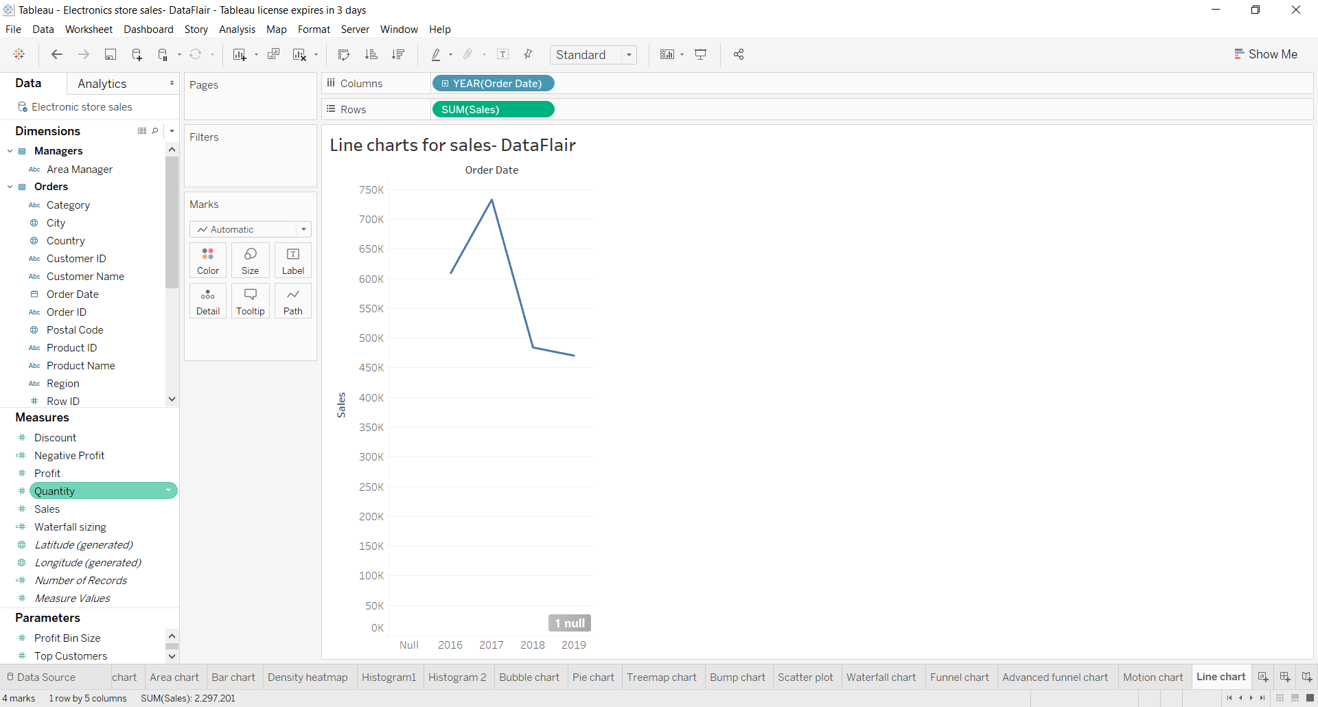
Step 1: Add Dimension Field and Measure Field
To begin with, we will add a dimension field in the Columns section and a measure field in the Rows section. We add Order Date (dimension) and Sales (measures) fields from our dataset.

This creates a preliminary line chart in the editing area. Now, we shall perform some more steps to create a dual line chart using two-measure variables.
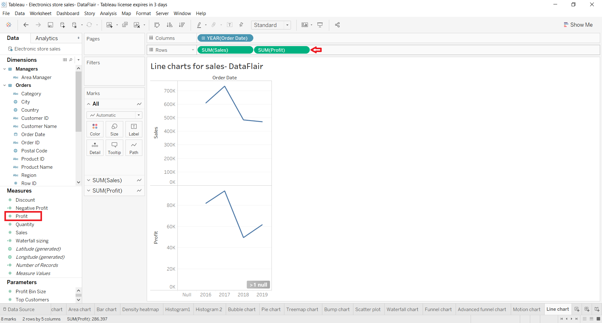
Step 2: Add Profit Measure Field to Rows
In order to do this, we add another measure field; Profits to the Rows section. This instantly creates another line chart, just below the first one showing profit values for all the concerned years.

Step 3: Drag SUM Measure Field to Y-Axis
Now that we have two different measure variables (Sales and Profit), we can treat them collectively as one measure. To do this, we drag our field SUM(Profit) to the y-axis of the chart.

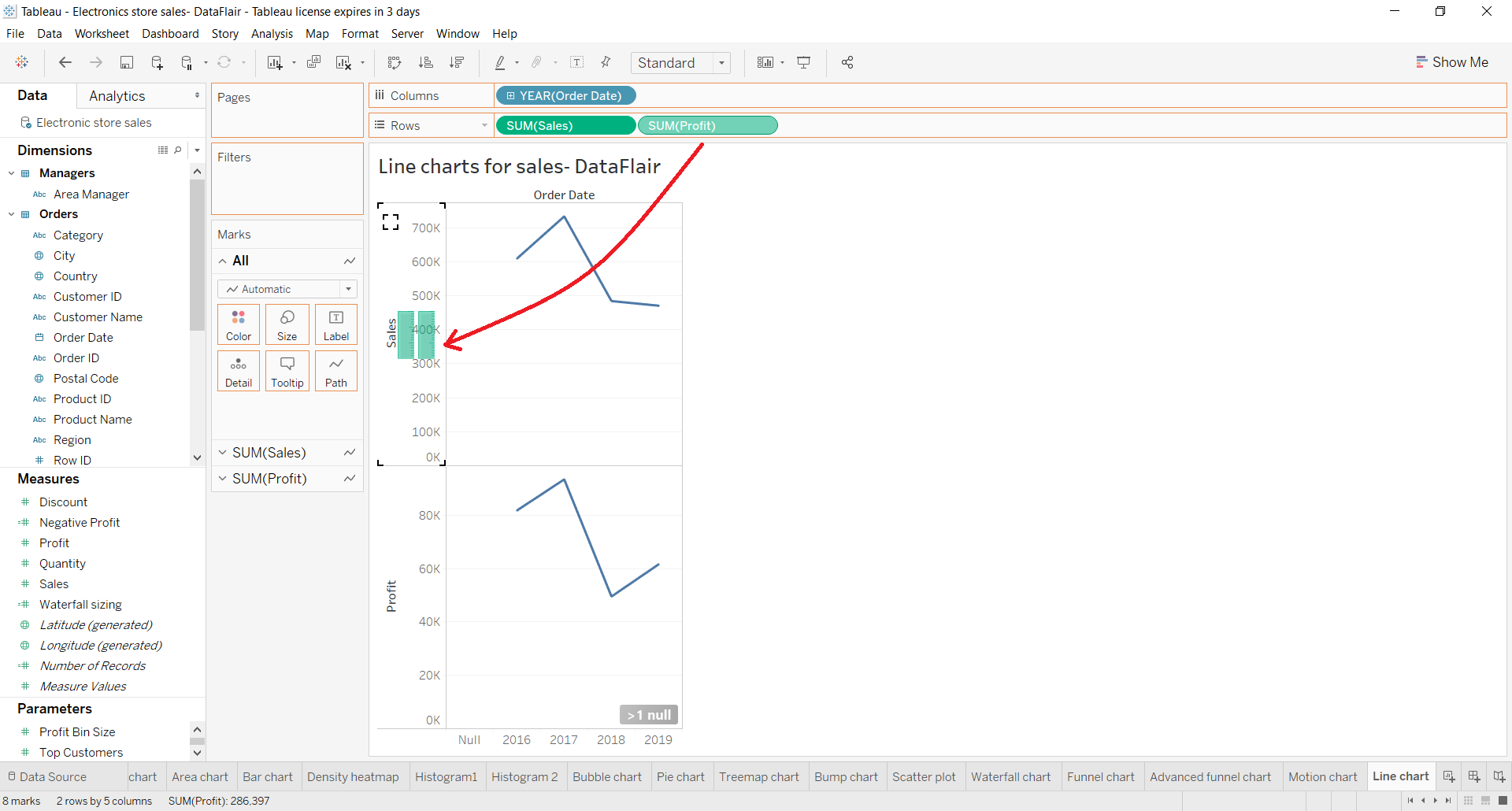
Step 4: Find the Details of Measure Fields
After this, we will have a common y-axis for both Sales and Profit values. Also, in the Rows section, we do not have two separate measures, instead, there is one Measure Value that contains both the measure fields. We can find the details of it in the Measure Values card beneath the Marks card.
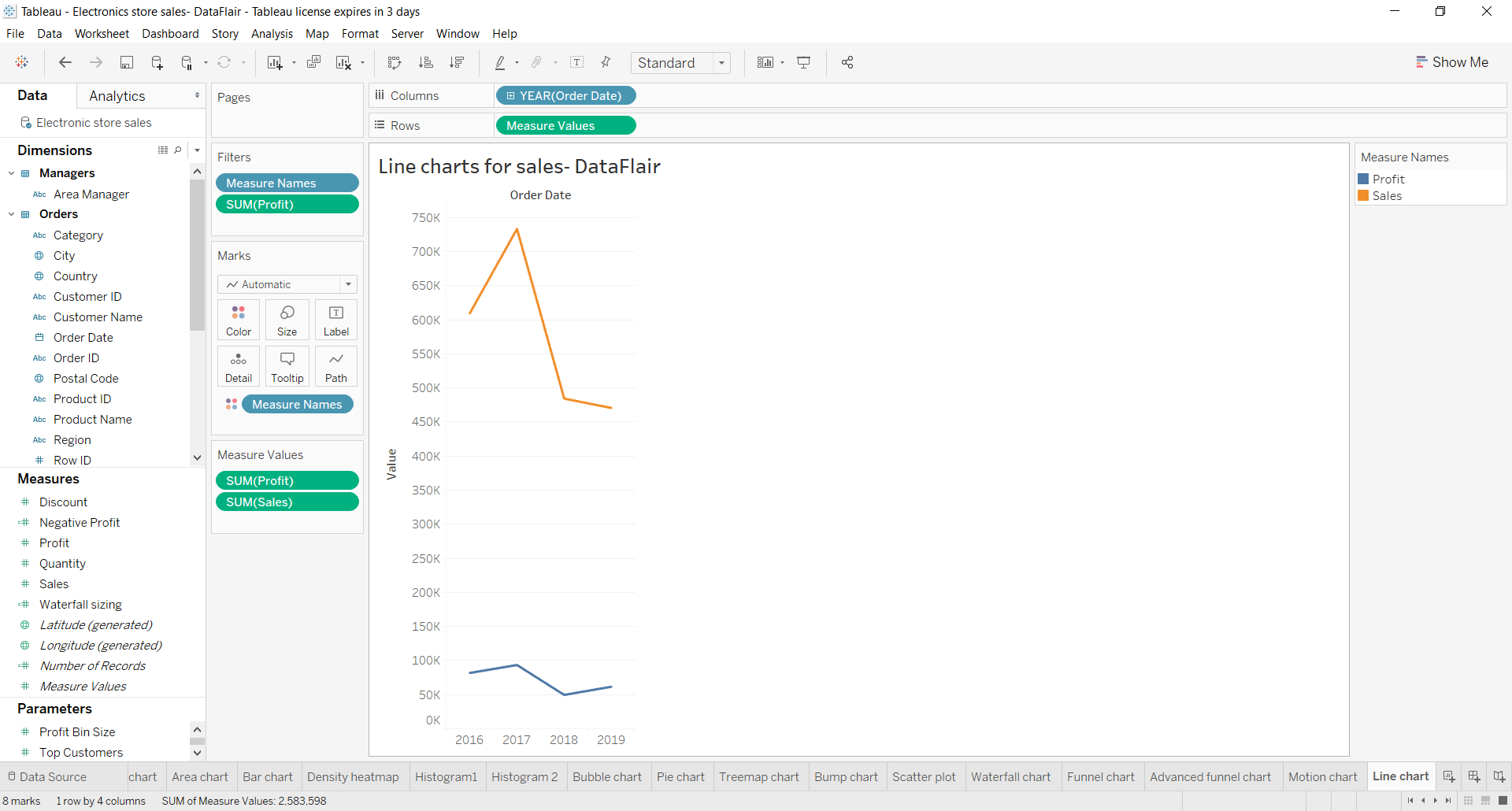
To make the two-line charts distinct from each other, we can put the field Measure Values into Color card. This shows the line for Profit as blue and for Sales as orange.

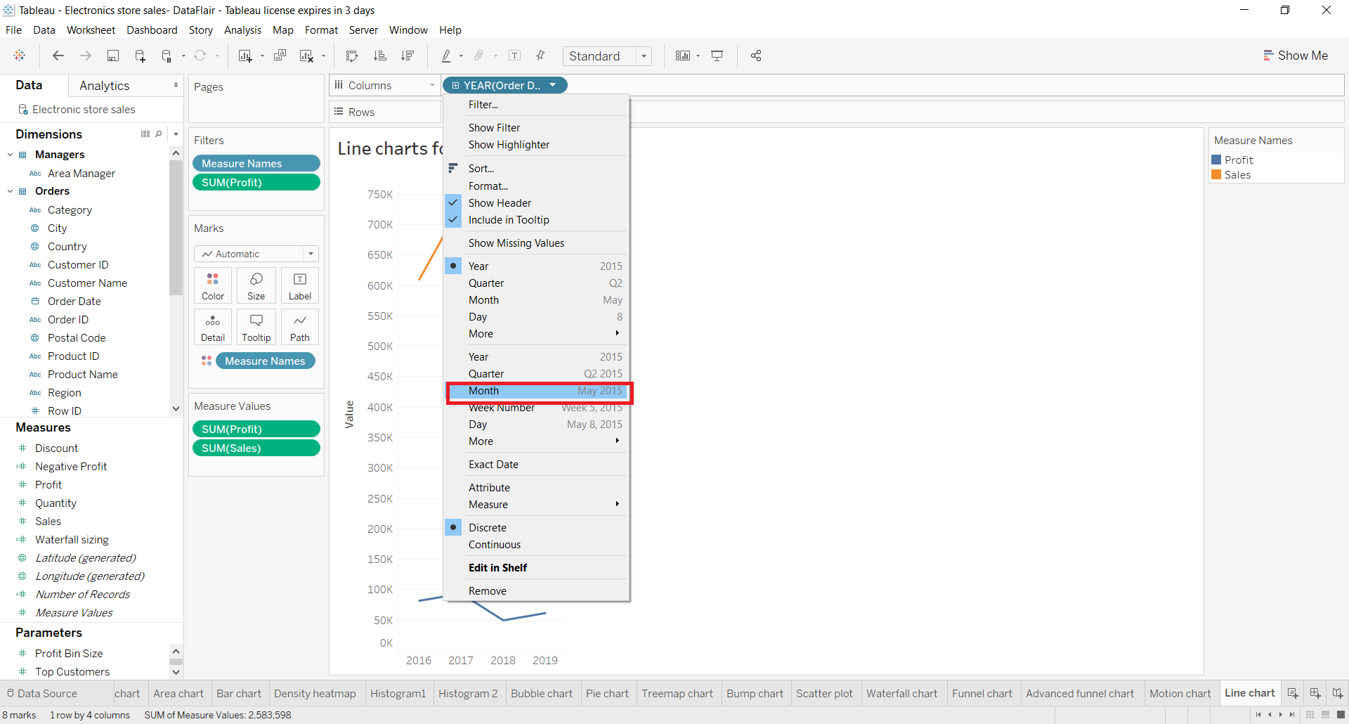
Step 5: Manage the Appearance of Tableau Line Chart
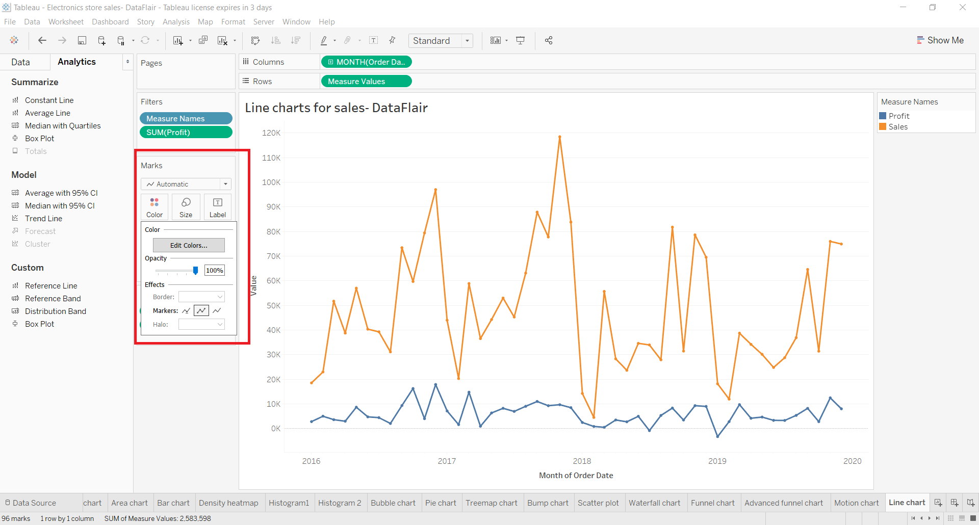
Now, we have two line charts sharing a common y and x-axis. We can also change the Order Date type from Year to Quarter, Month, Day, Week etc. We have changed it to Month.

As you can see in the screenshot below, we have data points for each month in the respective year. Upon putting our cursor on the data points, we can see the details of the month, year and profit or sales value.

We can also make changes in the color scheme, line opacity, chart borders, line markers, halo, etc., to enhance our line chart in tableau. To add data labels on the tip of each data point in the line chart, we can drag and drop our measure field in the Label card present on Marks card.

We can also add forecasting lines which are extensions of the existing lines showing forecasted or probable values for future or coming years. We will learn about Forecasting in Tableau in a separate tutorial.
Overview of Line Chart in Tableau
The chart refers to a graph in which we take measure along one axis and dimension along another. This can be discrete as well as continuous plots. The pair of values for each observation becomes a point and joining of all these points creates a line showing the relationship between the 2 axes. This is called a line chart. In this topic, we are going to learn about the Line Chart in Tableau.
If we have continuous data and we would like to represent through a chart then, the line chart is a good option. This kind of graph is very much required when we try to identify trends or patterns in our data to know the seasonal effect and large change over time. To represent the Time Series data line chart is very much required.
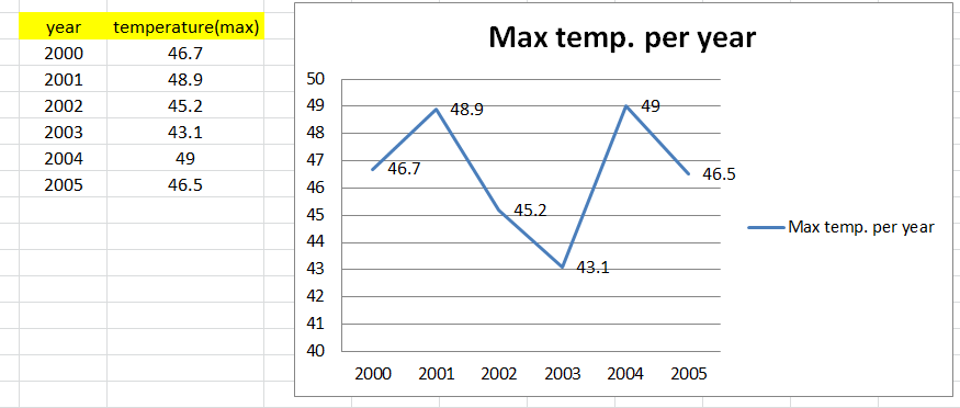
This is the basic line chart created in excel for better understanding. Below it describes the maximum temperature according to the given year and we have plotted that in the line chart.
Visualization in tableau
Data visualization is the presentation of data in a pictorial or graphical format. It is easy for us to see analytics in graphical form which enables us to grasp difficult concepts and identify new patterns. With the help of interactive visualization, we can take down concepts into the deeper drill down for more details.
We can make 2 kinds of Line chart.
i) Single/Simple line chart
ii) Multiple line chart
Single/simple line chart
A simple line chart shows the relationship between the dependent and independent values of a single set of data.
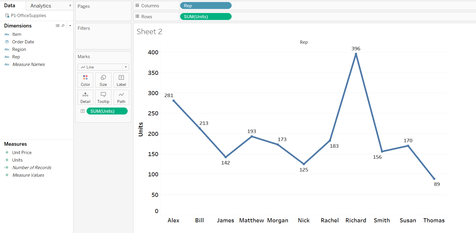
For the demonstration part in Tableau, we are going to use the below dataset in which data refers to the selling of items by some representatives in different regions with the number of products sold along with the unit price of it.
When we connect tableau with the .csv file, then automatically tableau will divide the dimensions and measures into different sections. In the columns (x-axis) we took ‘Representative’ and in the rows ( y-axis) ‘units’ have been taken for the visualization purpose in the below example (We just need to drag the measures and dimensions into columns and rows). In the “Marks” section we need to select the ‘Line’ for viewing the graph as a line chart.
NB – In the marks section we can set up which kind of graph we want. In the drop-down box, we have a bar plot, area plot, line plot, square plot and pie plot, etc. Based on our requirement we can choose options from them.
(This is a discrete single Line chart)
According to our input data tableau has drawn the line chart for us. To show the heading on the graph we need to drag the ‘Units’ from the measures onto the ‘Label’ as the arrow pointing towards in the above screenshot.
This graph tells us about the number of units sold by each representative.
Multiple line chart
A multiple line chart shows the relationship between the dependent and independent values of multiple sets of data.
Example #1
This multiple-line chart is very much required when we have more subcategories or in the case of a multi-dimensional variable.
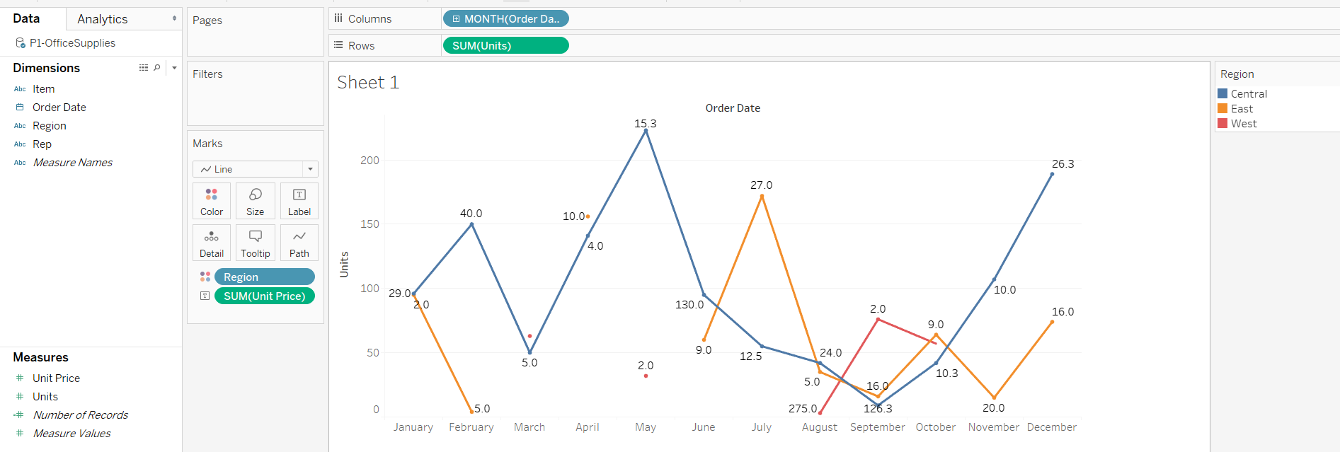
In this example, we have taken the ‘Order date’ in the x-axis and ‘Units’ in the y-axis. After extending the Order date year into months, we have dragged the ‘region’ from dimension into the color section as pointed below, then it creates multiple line charts stating the sum of units sold in every month segregated by region.
Blueline for the central region, Orange for East and Red for West region.
Example #2
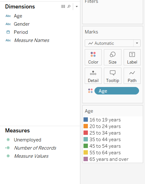
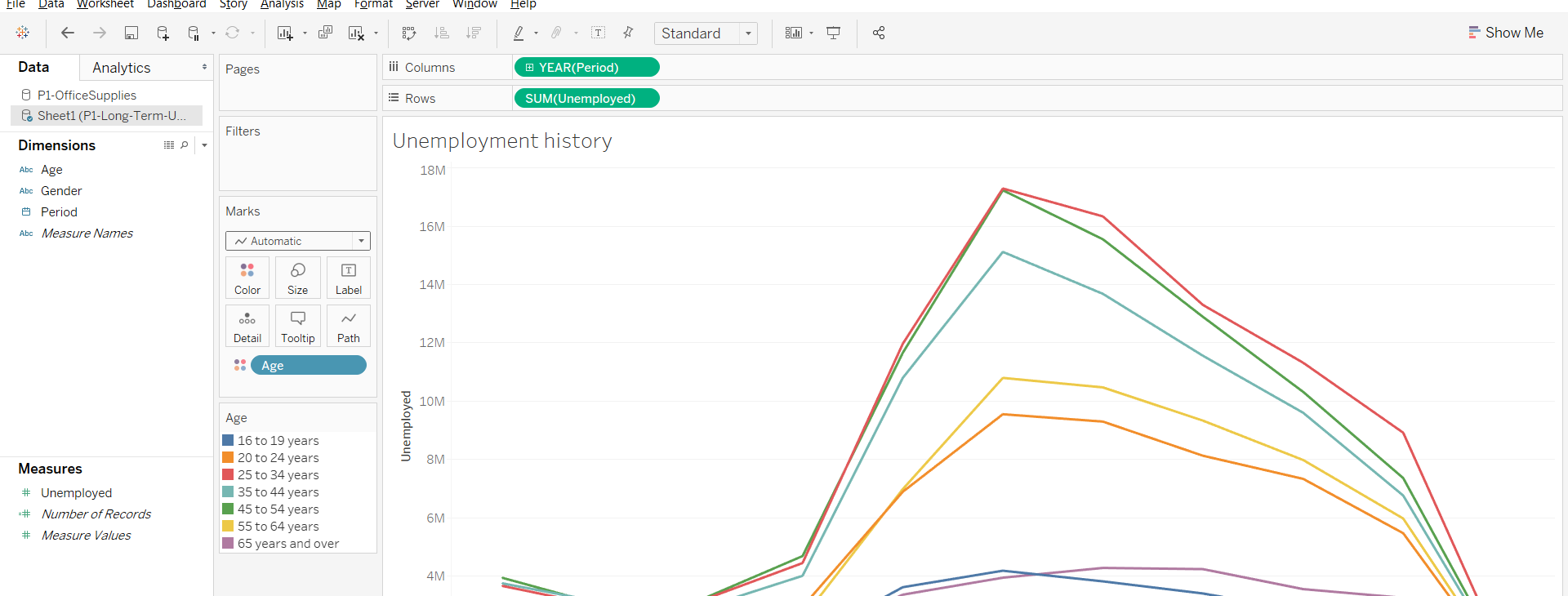
This dataset is about unemployed history over a period from 2005 to 2015 for many age groups like 16-19, 20-24, etc. With the help of the line chart in tableau, we are going to show for every certain age group what the unemployment history was over this period.
We have taken the “Period” – dimension in the columns and “Unemployed”- measures in the rows. The “age” – dimension has dragged onto the color section for the sub-category line plot for each age group.
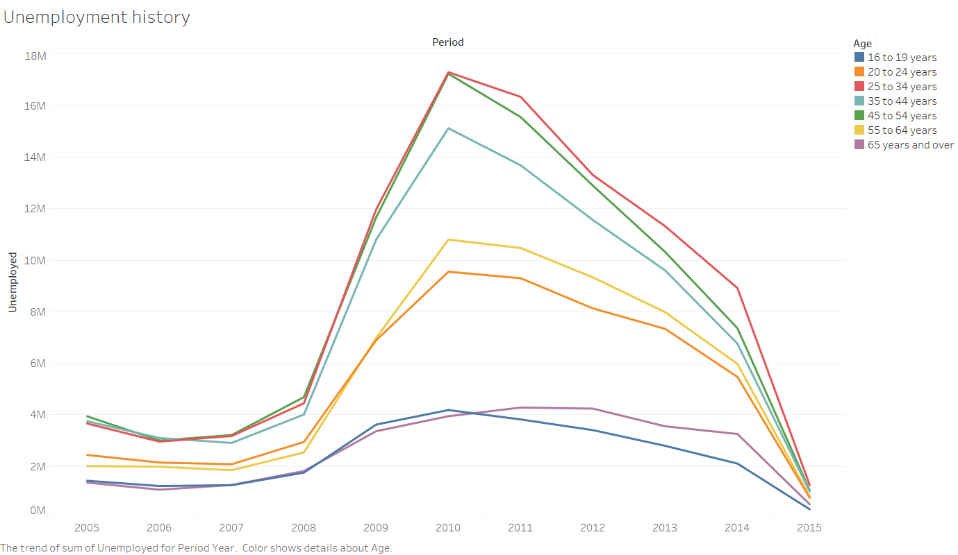
Here we can see the distribution of unemployment for each age group for the given period
NB: When the ‘mark’ has set to ‘automatic’, tableau gives the plot which best describes the data. Here tableau will automatically throw this type of line chart as a bar plot is not the best suitable for gaining insight from this kind of data.
With Continuous Data
All those examples we have seen yet in this article are with discrete data. Let’s create another example of a line chart with continuous data.
As in this article many times we have come across discrete and continuous data, I would like to give one brief definition about them. Discrete data can take only particular values. They may be an infinite number but each is distinct and there is no grey area in between. This may be numeric like the number of apple/population strength or categorical like male or female, red or blue, etc. Continuous data are not restricted to define separate values but can occupy any value over a continuous range. Between any two continuous values, there may be infinite others.
This is the dataset of startup expansion in a different region with market spend and revenue amount. We will plot a line chart between market spend & revenue.
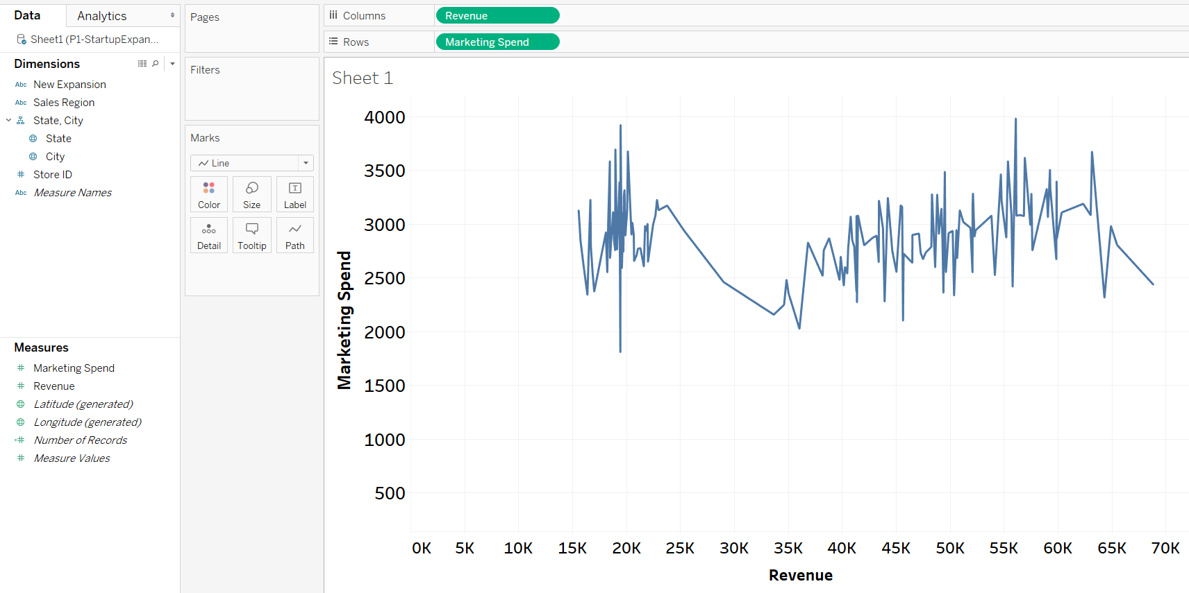
This chart shows us the pattern between the market’s spend and revenue. Both the variables are numerical and many points are present between two data.
Another Way of Creating Line Chart
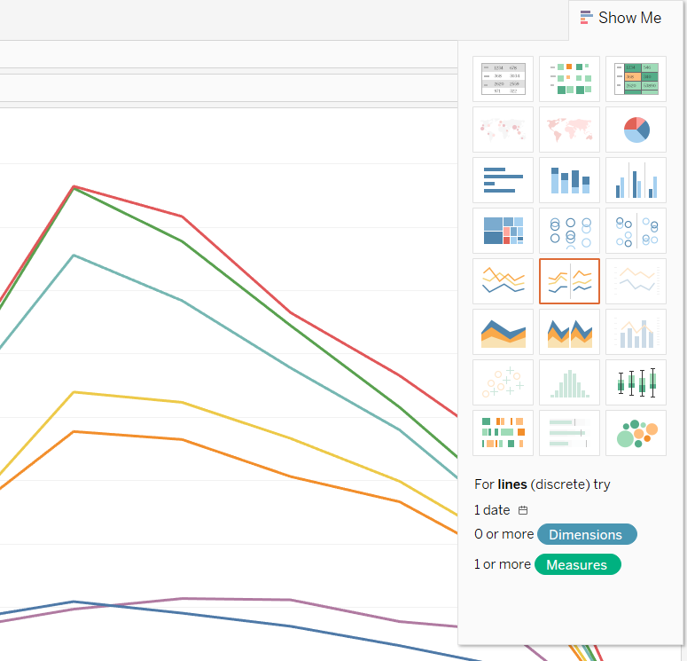
Apart from this way, there is another way of creating a line chart in Tableau. In the top right corner of Tableau screen, a “Show me” option is available. In that drop-down, we can select many kinds of plots for visualizing our data. In the below screenshot highlighted section creates a line chart for us.
Step-1: We need to click on below-marked section – “Show me”
Step-2: Among the below-marked section we can choose one based upon our data whether data is continuous or discrete.


Comments
Post a Comment